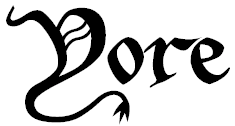
This blog has had the same logo since 2012, and it felt like it needed an update.
Here’s the new logo:

It’s in the Disco Inferno font created by Nick Curtis of Nick’s Fonts, which I licensed for use here on Yore.
The old logo, retired as of today, was this one:

Regrettably, I didn’t take notes about who created that free font and none of my searching has turned it up again.
I still dig it, and the “medieval manuscript” look certainly fits a lot of Yore’s content and the frame of mind I was in when I made the logo (IE, a focus on old-school RPG stuff), but it was time for a change.
The name, Yore, still feels right to me. Many of my hobbies, notably tabletop RPGs and miniature painting, have their roots in stuff created 40-plus years ago. So it’s Yore as in “days of yore.” But it’s also Yore as in “I’m getting older.” I’ve been playing TTRPGs since 1987. I painted my first miniature around then as well. I’ve been playing board games my entire life (etc.).
The new logo just clicks for me. It still flirts with illegibility (until you see it, and then you can’t unsee it), which tickles me a bit. It implies layers and a measure of depth, which fits my general approach to blogging. And it evokes a 1970s sci-fi novel cover font, something you’d see looming over some weird alien and a starship of improbable design on a far-flung world, dog-eared and purchased in a secondhand bookshop, opening a door to someplace strange and interesting.
That’s Yore.
